We were invited by See Media to collaborate on a visual identity for Management Consultancy and social housing experts Campbell Tickell
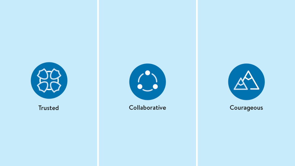
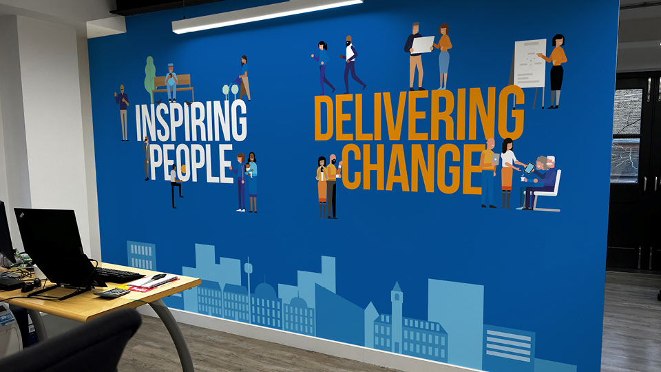
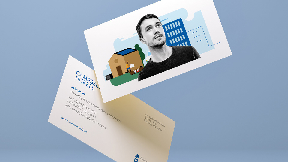
Having defined ‘Trust’ and ‘Change’ as core values, we looked to build a visual identity that carefully balanced these two themes. We proposed a restrained, type - only logo and a predominantly ‘safe’ blue colour palette, and offset this with striking graphics that combined vector illustrations with cutout images of people
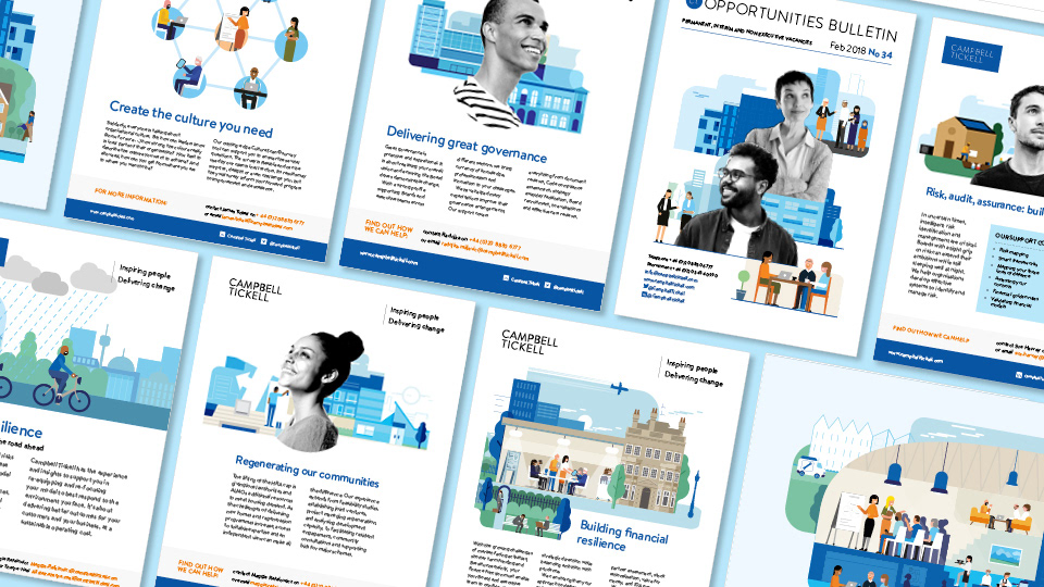
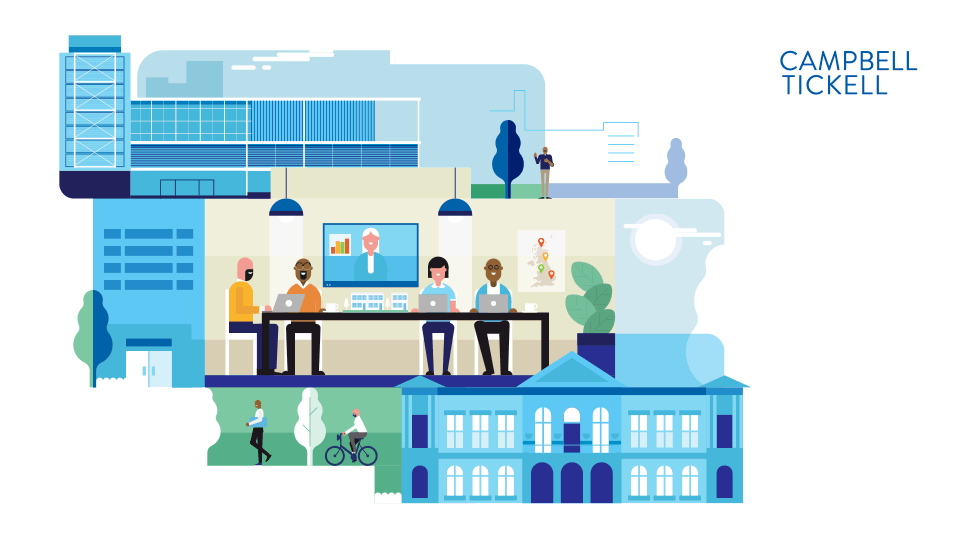
There is a lot of this style of illustration around, so we were keen to make CT’s illustrations stand out by giving them some depth, choosing to base characters and settings around real life CT case studies.
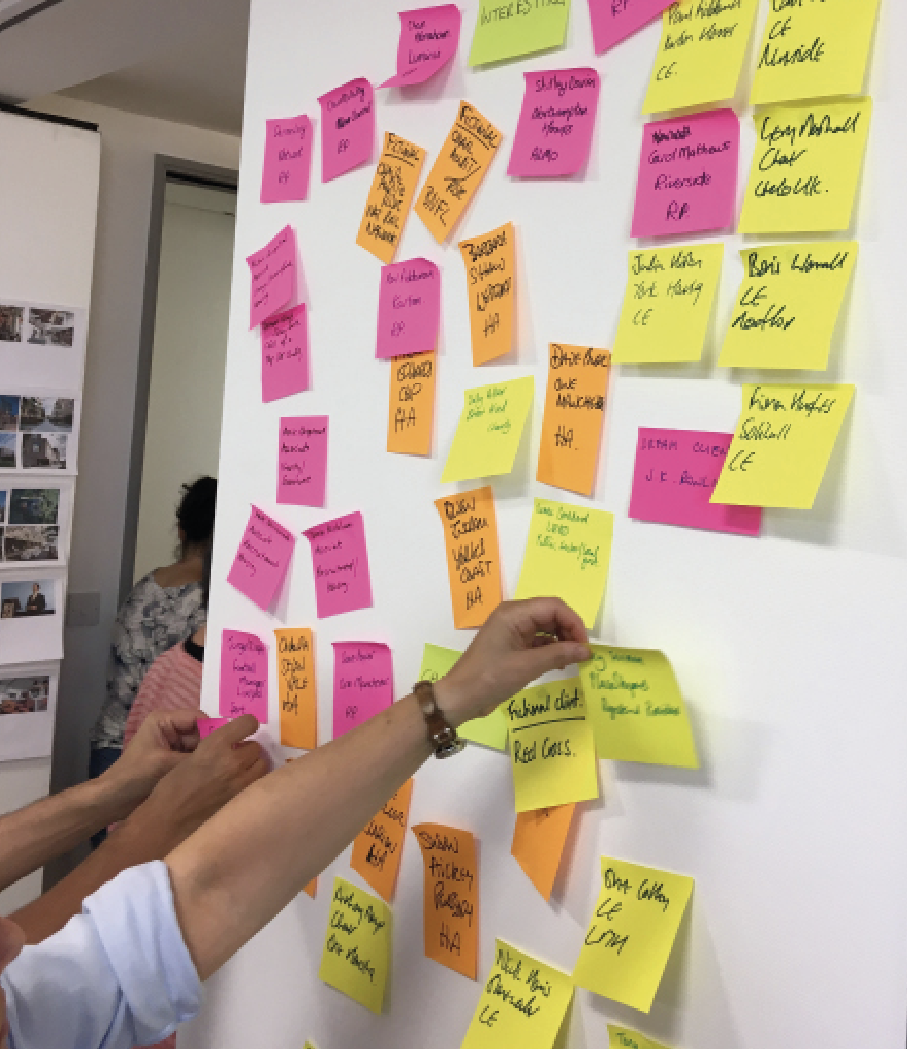
We designed and hosted a one day workshop, making use of post-it note sessions that allowed the team to create 6 detailed written scenes that formed the basis of our illustrations. These combined people, places and examples of CT ‘delivering change’ for their clients.
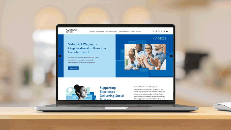

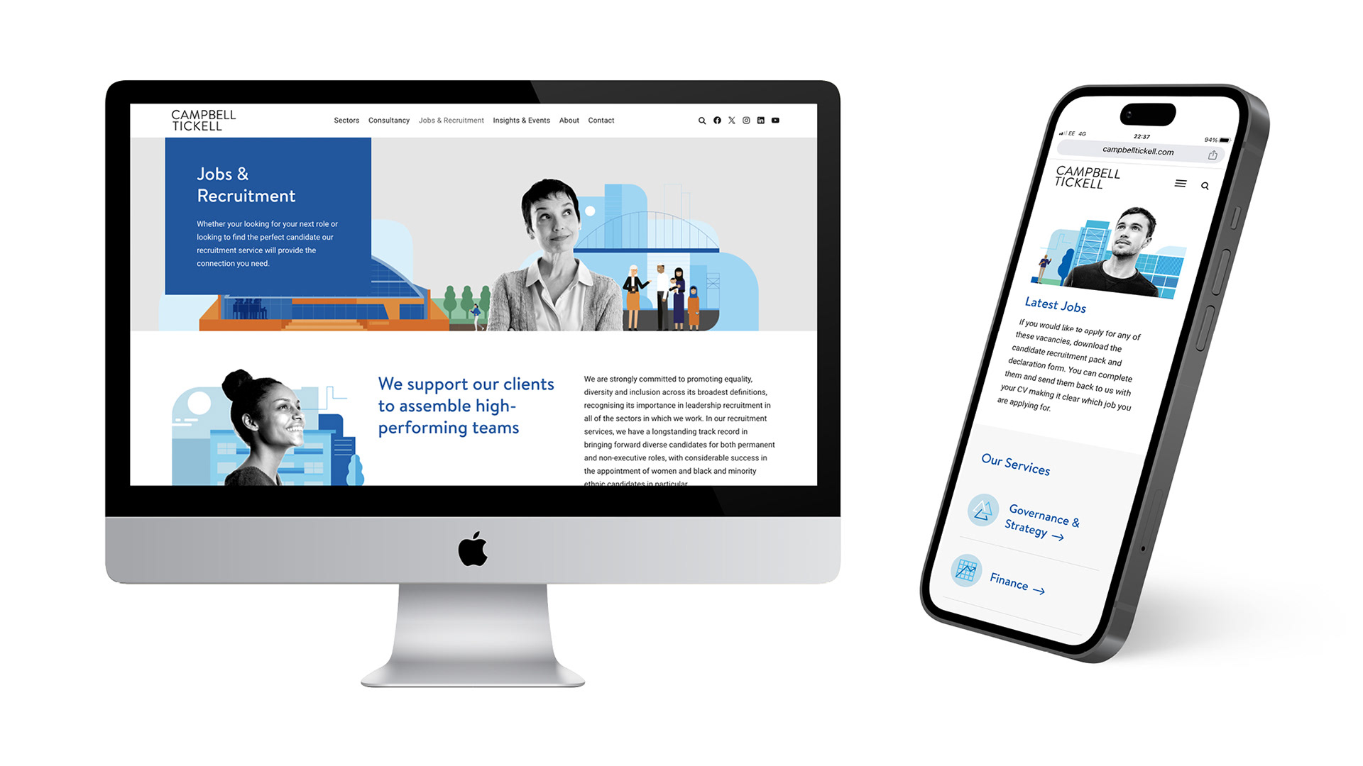
In 2023 we carried out a full review and redesign of the Campbell Tickell website in collaboration with our friends at Effra Digital. This involved a ‘discovery’ research phase, UX recommendations, and a complete redesign of the site layout and graphics
View the website at www.campbelltickell.com
We have also applied this identity to print ads, social graphics, business cards, regular publications, exhibition graphics, and a full height wall mural for the client’s offices
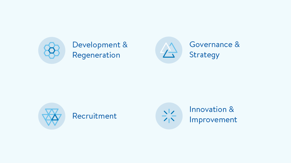
Another key element of the identity was a bespoke set of abstract icons depicting the services Campbell Tickell offer, as well as ‘manifesto’ and ‘values’ icon sets