
The Identity
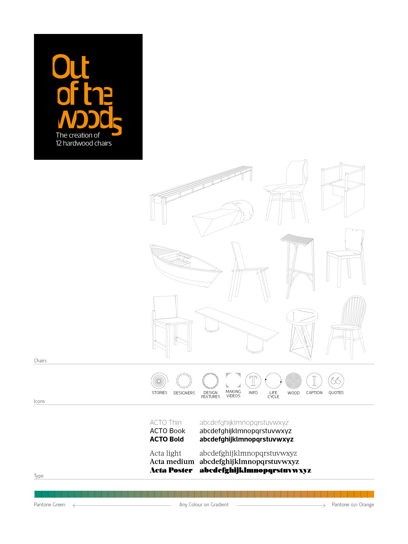
Both logo and colour scheme use the theme ‘out of the woods’ as a starting point. The colour scheme uses a gradient to create a palette ranging from orange to green
The key elements of the brand were:
Typographic logo/masthead
Colour scheme
line illustrations of all 12 chairs
a set of icons used to indicate types of information across all media
The Magazine
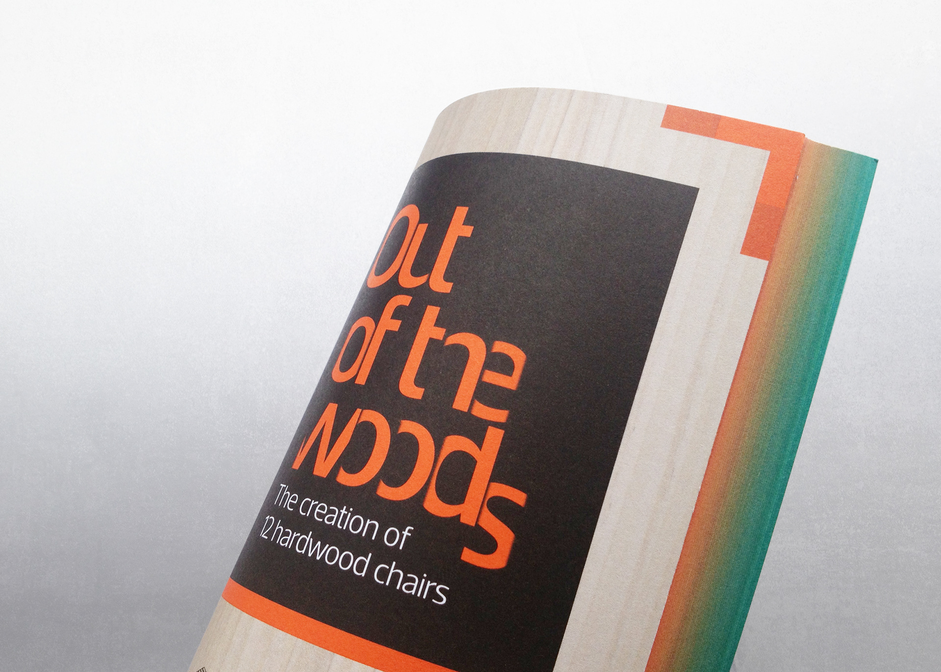
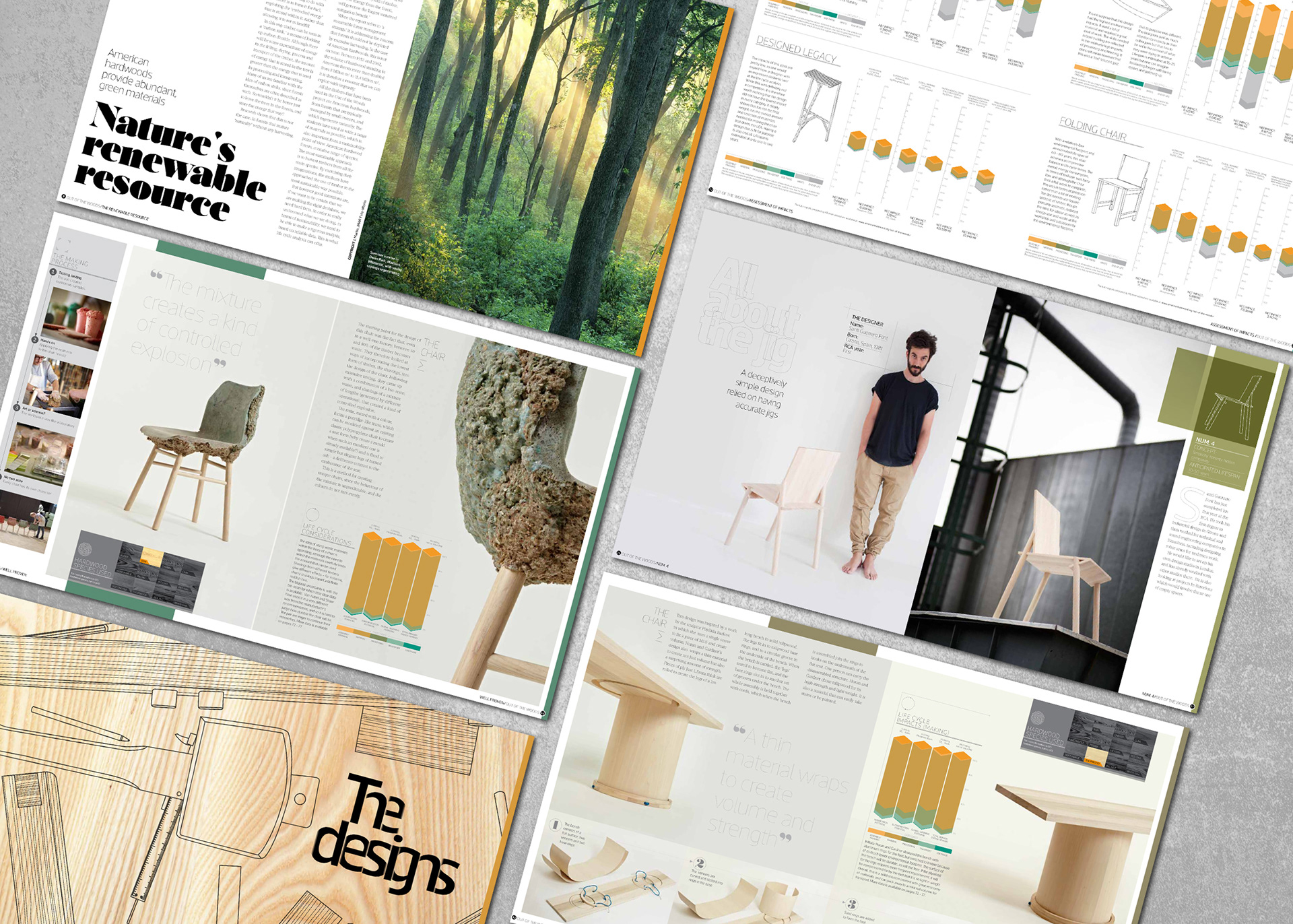
Printed with 6 colour covers on uncoated matt stock throughout to reflect the hardwoods used in the project. The gradient is used both vertically on the spine and horizontally on the foredge to further reinforce the ‘out of the woods’ theme.
Printed with 6 colour covers on uncoated matt stock throughout to reflect the hardwoods used in the project. The gradient is used both vertically on the spine and horizontally on the foredge to further reinforce the ‘out of the woods’ theme.
The iPad app
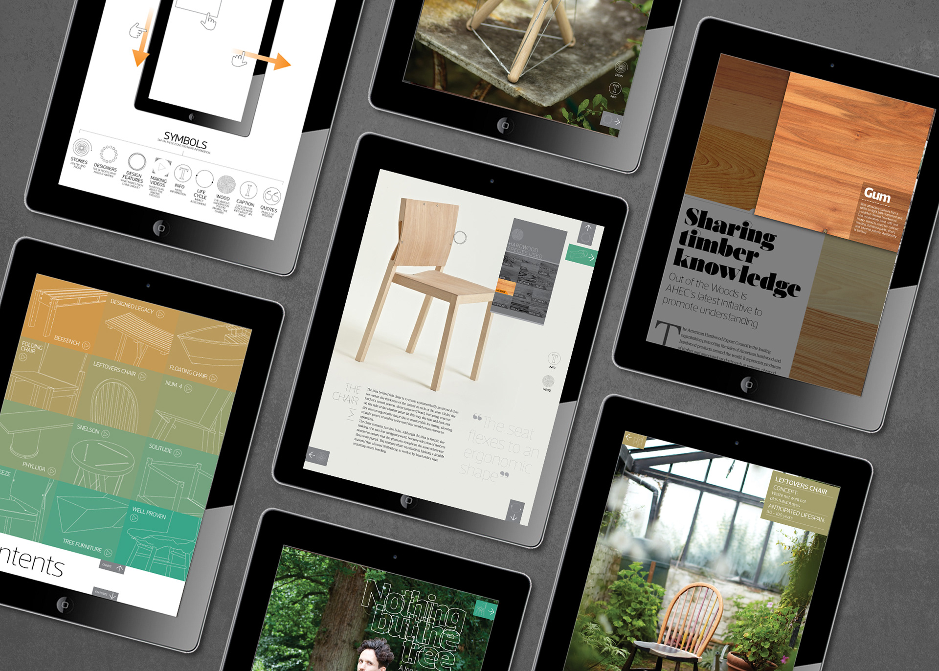
Fully interactive app including image galleries & video, that allowed us to tell the unique story of each chair, and to make the most of Peter Krejci and Mark O’Flaherty’s stunning photography.
To download the app click here:
Fully interactive app including image galleries & video, that allowed us to tell the unique story of each chair, and to make the most of Peter Krejci and Mark O’Flaherty’s stunning photography.
To download the app click here: